
Tradeshow booth for Milliken
Visual storytelling, brand guidelines and 3D layout planning
The Problem / Challenge
Develop 2–3 design concepts for a tradeshow booth for Milliken’s textile business, specifically focused on fire service. Present innovative booth designs that resonate with multiple audience segments. Ensure designs are scalable and reusable across different events.These products have traditionally been presented with orange accents and black-and-white photography. We would like to move back to Milliken Blue as the primary color. Rich, layered textures and modern design are preferred, though color photography may also be used. Demonstrate use of AI tools. (e.g., for ideation, layouts, color palette testing, etc.)
*Trade show template provided by Milliken
Audience Strategy
Designed for multiple stakeholder groups with different needs: PPE safety committees, firefighters, dealers/distributors, and garment manufacturers.
Balanced emotional trust and safety for firefighters with technical credibility and compliance for decision makers.
Created clear visual hierarchy so each audience could quickly understand what the product is, why it matters, and how it benefits them.
Concept Development
Addressed growing concerns around PFAS exposure without implying performance trade-offs.
Helped reduce complexity for buyers by visually communicating Milliken’s complete, single-source non-PFAS system.
Supported confidence in specification by reinforcing NFPA compliance, performance, and long-term reliability.
Use of AI Tools
Used AI to accelerate early ideation, explore layout and visual directions, and test color and messaging approaches.
Applied AI as a strategic support tool to increase efficiency while maintaining design judgment and intent.
User experience
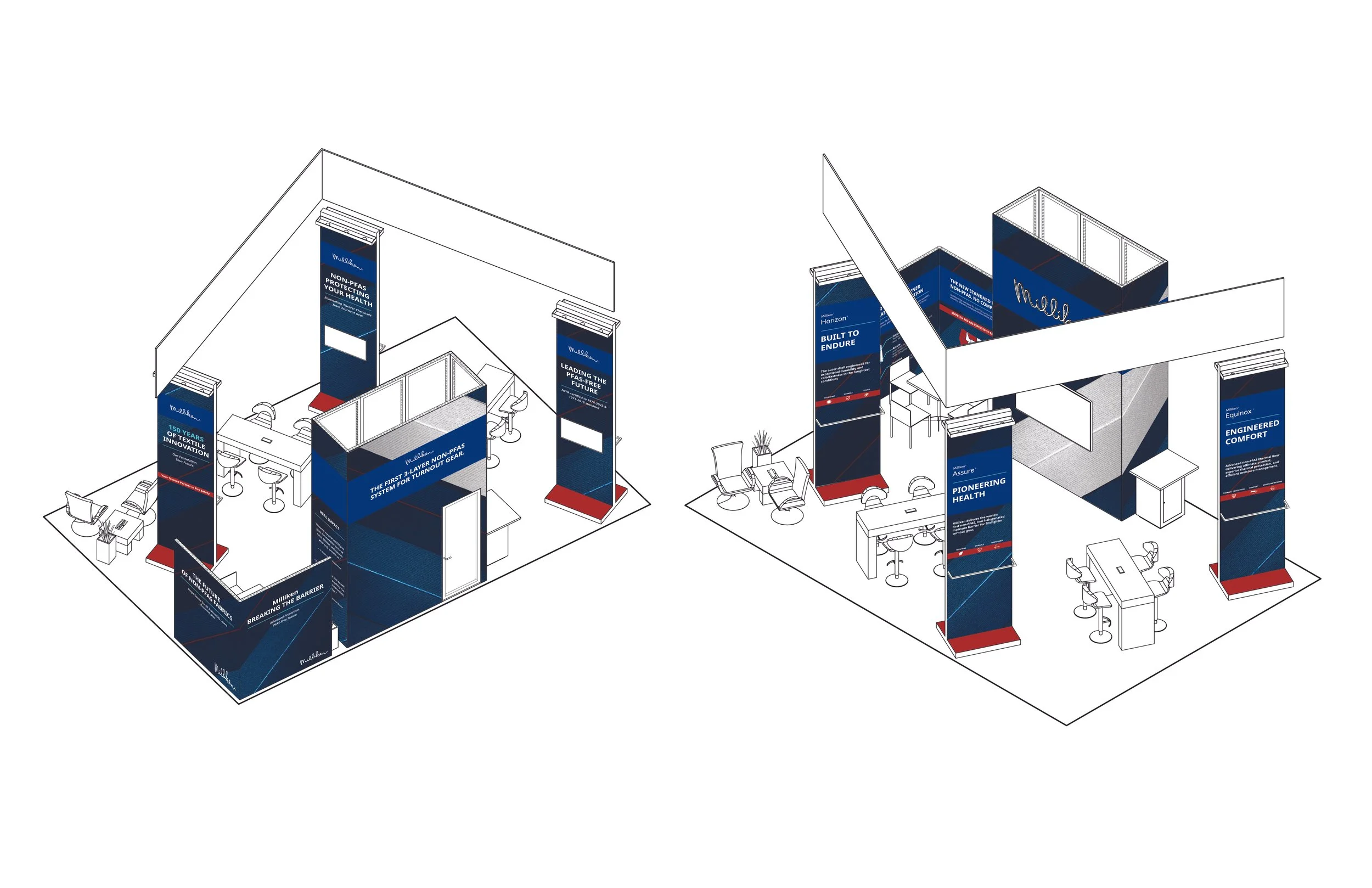
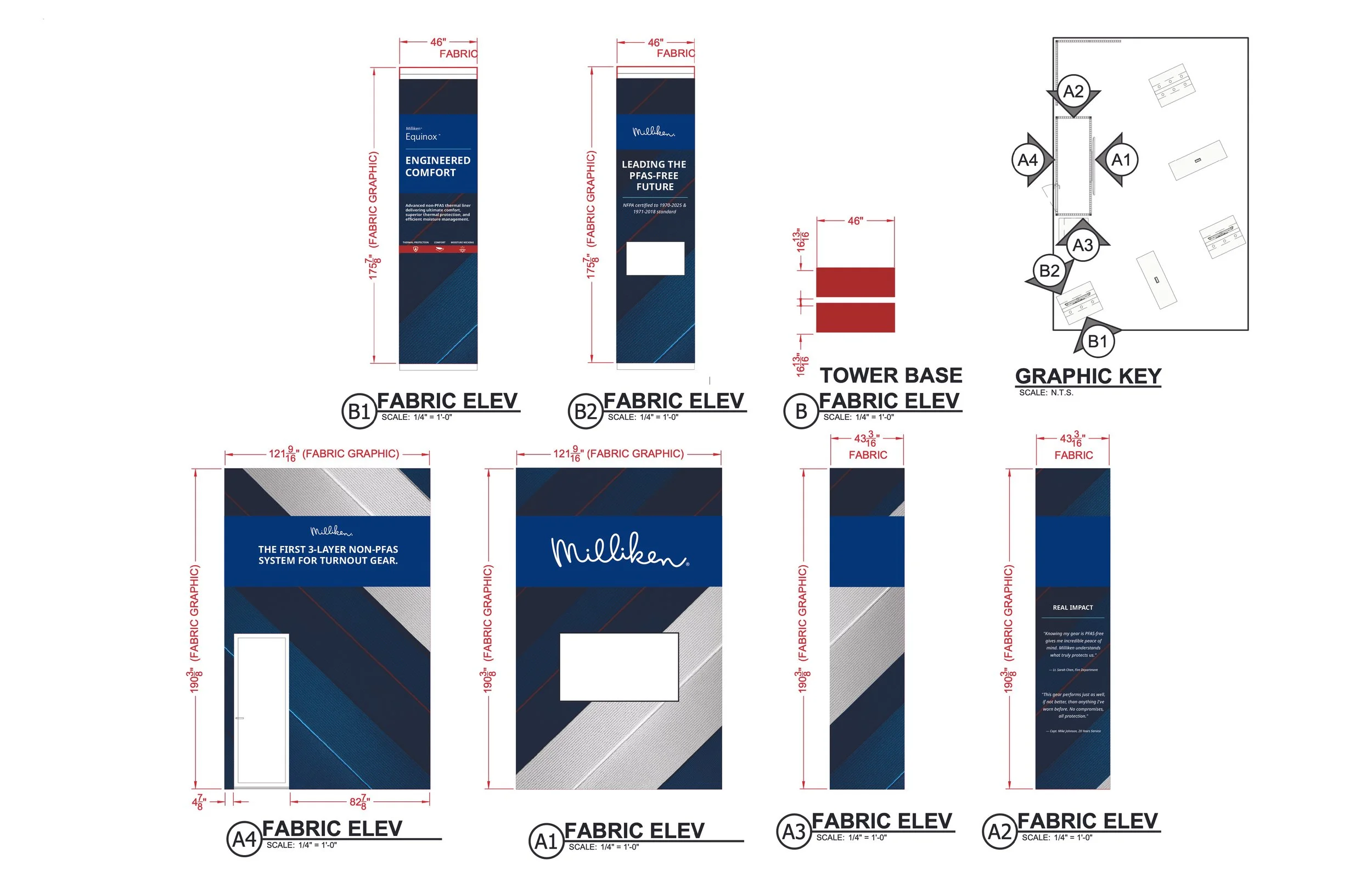
User experience informed the booth’s spatial hierarchy and messaging zones, with content intentionally distributed based on visitor proximity and dwell time. The perimeter of the booth was designed for high traffic visibility, focusing on brand credibility and clear, high-level messaging around Milliken’s single-source non-PFAS system and key performance advantages. This outward facing layer was meant to quickly engage firefighters and PPE safety committees as they passed by. As visitors moved deeper into the booth, the environment transitioned to more detailed, information-rich content. Technical graphics and infographics were positioned near the meeting and table areas, supporting longer conversations with dealers, distributors, and garment manufacturers. This zoning strategy allowed the booth to function both as a bold brand beacon and as a space for focused education and relationship-building.
Design Strategy
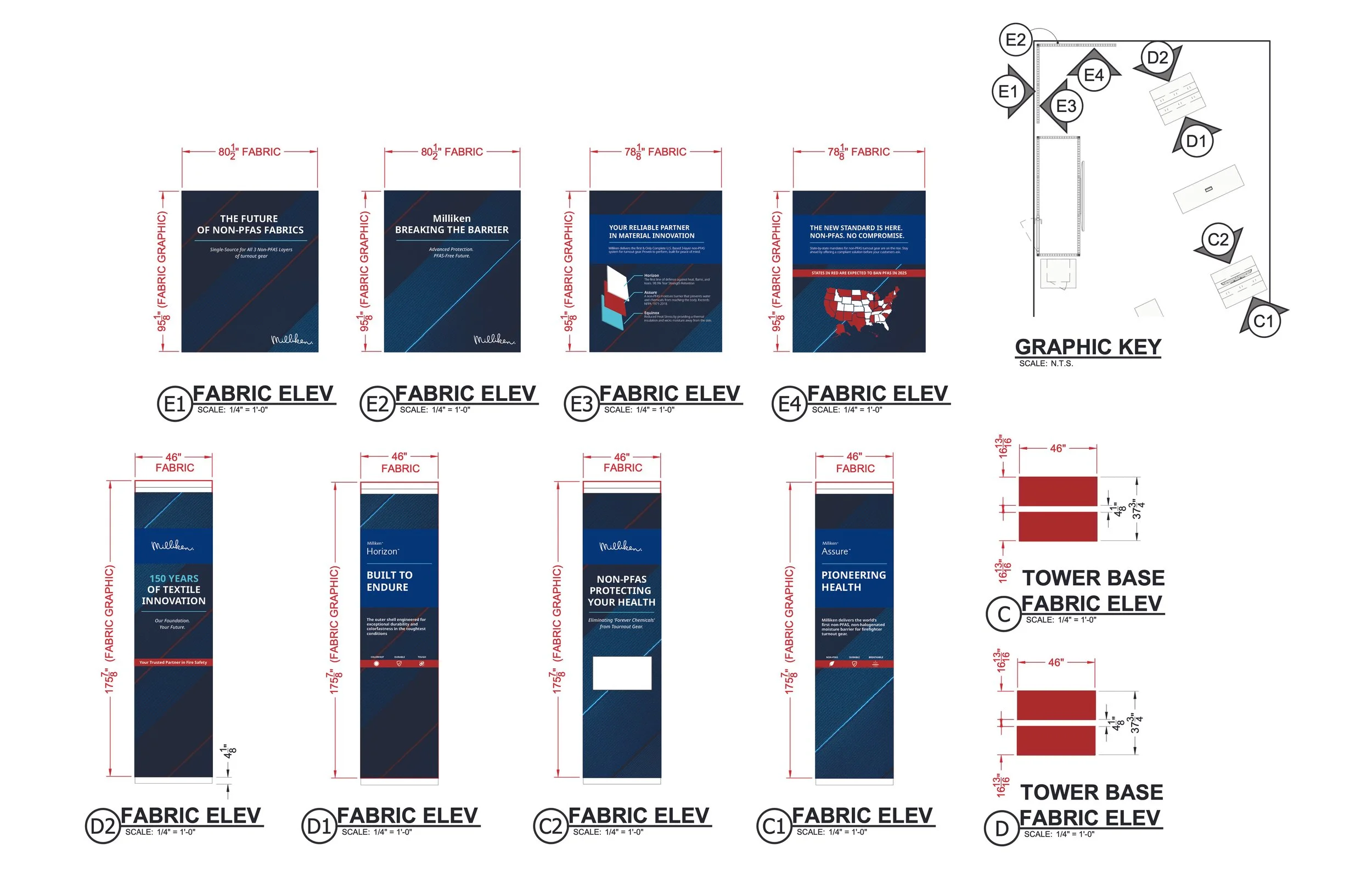
The booth concept was built around Milliken’s three-layer non-PFAS system, with the design visually expressing this idea through layered graphics and material-driven textures. Fabric-inspired background textures referenced the performance textiles at the core of the product. A red, white, and blue color structure was used intentionally to reinforce Milliken’s position as a U.S. based manufacturer while subtly connecting to the sense of service and patriotism associated with first responders. Together, these elements created a cohesive visual narrative that tied product innovation, material science, and brand values into the physical environment of the booth.

Background texture
Messaging Hierarchy & Content Strategy
Messaging was developed to quickly connect with multiple audiences while reinforcing Milliken’s brand values. Key terms such as safety, reliability, health, durability, and innovation were used intentionally, as they resonate with firefighters, PPE decision makers, and manufacturing partners while aligning directly with Milliken’s reputation in material science and protective textiles. These words functioned as high-impact entry points, allowing passersby to immediately understand the value proposition before engaging in deeper conversations.
Each non-PFAS layer was given its own dedicated display, with a clear hierarchy that prioritized the trademarked product name followed by a concise, benefit-driven message. Rather than technical overload, copy focused on clearly stating the problem each layer solves and the performance objective it delivers, using simple, memorable language. This structure allowed the booth to communicate complex, technical information in an accessible way supporting quick comprehension at a distance while enabling more detailed discussion during longer interactions.